

Most business cards get a polite glance and then disappear into a drawer. Cool business cards are different. People hold onto them, show them to a colleague and remember who handed them over.
The catch is that cool is easy to overdo. Pile on too many effects and the card looks busy. Pick a finish that fights the design and your details get lost. A card that tries too hard can feel cheaper than a plain one.
This guide gives you 15 ideas that work, each with the stock or finish behind it and how much effort it takes. As a print company Melbourne businesses use for cards like these, we'll also show you how to set up your file so each effect prints the way you pictured it.
Here's Everything You Need to Know in Under a Minute
Short on time? Here's what matters most.
- Cool cards mix three things. A material that feels good, a finish people notice and a reason to keep the card.
- Pick one hero effect. Spot UV, Scodix or metallic raised foil looks best on a single element.
- Stock does a lot of the work. Heavy and textured options like Buffalo Board, artboard and premium uncoated stand out on their own.
- Give the card a job. An appointment or loyalty back means people keep it in their wallet.
- Set up special effects properly. They need their own 100% K vector layer, plus 3 mm bleed on the artwork.
- Every idea comes with a recipe. You'll get the stock, the finish and an effort tier: Simple, Step Up or Statement.
Table of Contents
- What Makes Cool Business Cards Stand Out
-
15 Cool Business Card Ideas to Try
- 1. Minimal Type on Heavy Stock
- 2. Spot UV Logo on a Matt Card
- 3. Raised Texture You Can Feel
- 4. Metallic Foil Accents
- 5. Soft Touch Velvet Luxury
- 6. All Black Tone on Tone
- 7. Crafted Uncoated Card
- 8. Eco Card on Recycled Stock
- 9. Colour Suite Set
- 10. Bold Bright Illustration
- 11. Brand Pattern on the Back
- 12. Blueprint Style Linework
- 13. Appointment or Loyalty Back
- 14. Folded Card With More Room
- 15. A QR Code Done Right
- Cool Business Card Ideas Compared
- How to Set Up Your File So the Effect Prints Right
- Mistakes That Make a Cool Card Look Cheap
- Print Your Cool Business Cards With The Print Company
- Frequently Asked Questions
- Make a Card Worth Keeping
What Makes Cool Business Cards Stand Out
Cool business cards combine clever materials, tactile finishes and a practical use, so people want to keep them. They feel different the moment they land in your hand. They still do the basic job, too: telling people who you are and how to reach you.
These are the design trends doing that well.
Tactile finishes
- Scodix adds a raised, clear gloss layer.
- Spot UV puts a gloss highlight on one part of the card, such as a logo.
- Velvet laminate gives the whole card a soft, smooth touch.
A metal look
- Metallic raised foil adds a polished, metal-look highlight.
Art meets function
- An appointment or loyalty back turns the card into something people use.
- Folded cards give you extra panels without losing the card format.
Where to make and order them
Bring your own artwork or work with a designer, then order custom business cards from The Print Company in any of the stocks and finishes in this guide.
15 Cool Business Card Ideas to Try
Each idea below covers why it works, how to print it and the effort involved. Simple means a standard stock or finish. Step Up adds one premium touch. Statement is for when first impressions really count.
1. Minimal Type on Heavy Stock
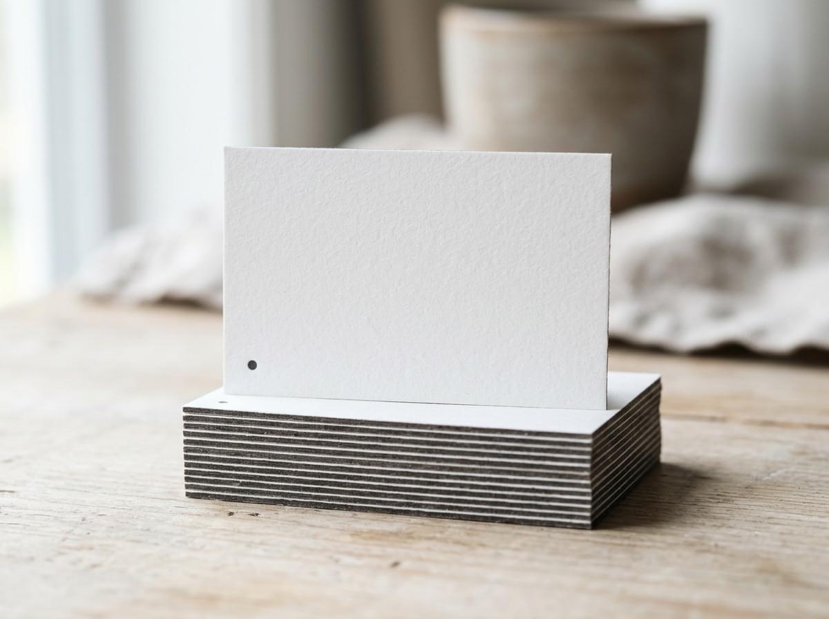
A name, a title and one line of contact details, set in a clean typeface on a thick board. Nothing else. The weight of the card does the talking, and people notice it the second they take it.
It works because heavy stock feels considered. Plenty of white space also makes your details easy to read at a glance.
How to print it: Buffalo Board for maximum thickness, or artboard for a smooth, crisp surface. Effort: Simple.
2. Spot UV Logo on a Matt Card
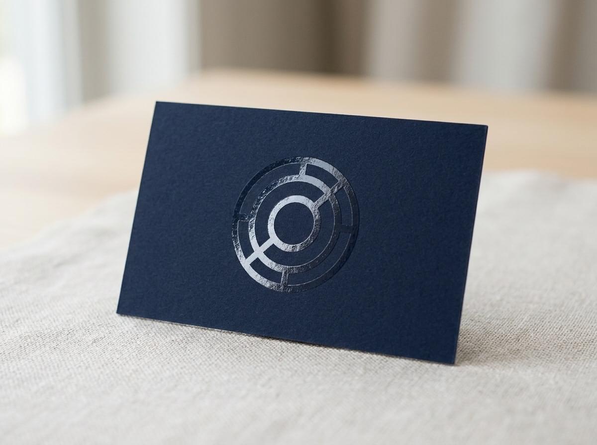
Your logo sits in high gloss on a soft matt background. Tilt the card and it catches the light. Hold it flat and it stays quiet and professional.
The contrast between dull and shiny is what draws the eye. It's an easy upgrade that suits almost any brand. A matt laminate also helps the card resist scuffs.
How to print it: matt laminated card with Spot UV on the logo only. Effort: Step Up.
3. Raised Texture You Can Feel
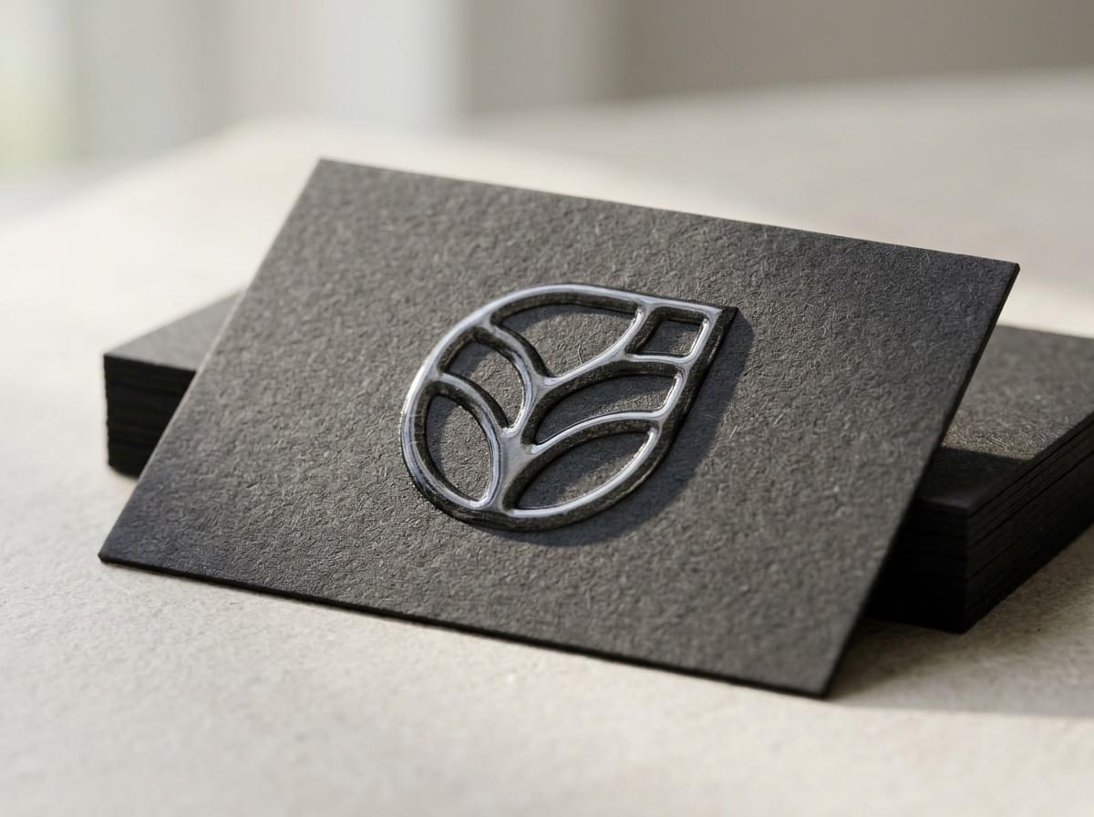
Scodix adds a clear, raised gloss layer that stands up off the card. Run a thumb over the logo and you can feel its shape. That small moment makes the card memorable.
Use it on a logo, a pattern or a single word. It looks best with plenty of room around it.
How to print it: Scodix on a laminated card. Effort: Statement.
4. Metallic Foil Accents
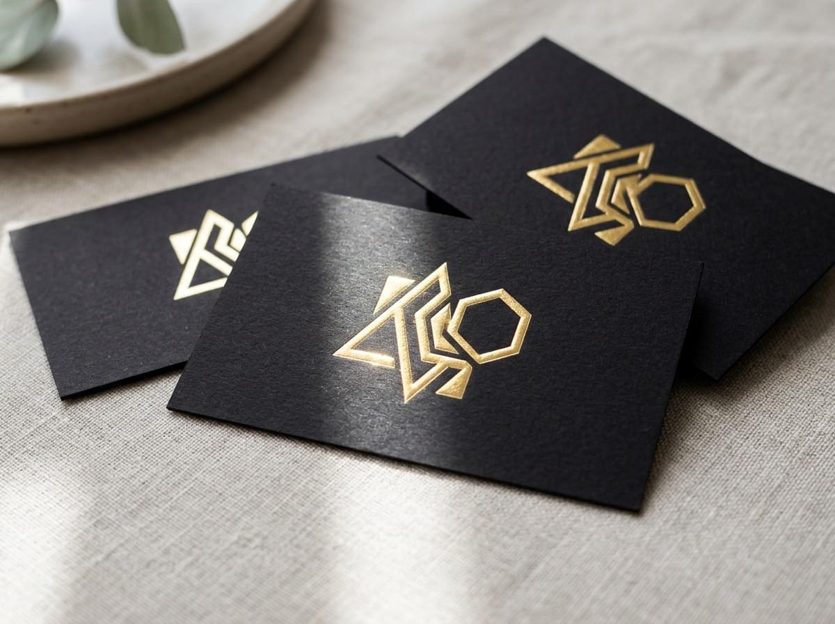
A touch of metallic shine on a name or icon looks refined and considered. Raised foil also has a slight lift, so it catches both light and fingertips.
Keep it to one element. A foil logo on a dark card is a classic for good reason.
How to print it: metallic raised foil on one bold element, such as your logo. Effort: Statement.
5. Soft Touch Velvet Luxury
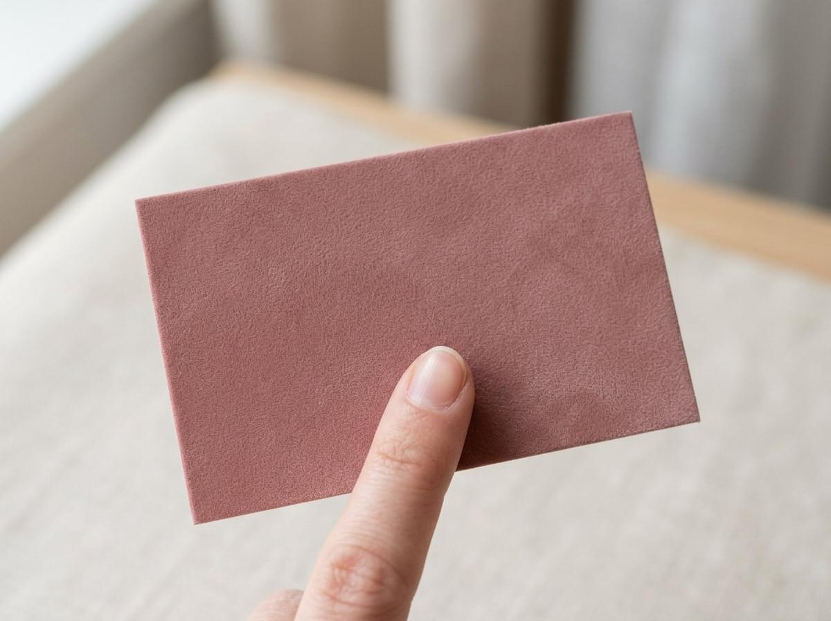
Velvet laminate gives the card a smooth, almost suede feel. People often rub it between their fingers without realising. It suits beauty, fashion, property and any brand that wants to feel premium.
It also resists scuffs better than gloss, so it still looks good after a few weeks in a wallet.
How to print it: velvet laminated card, on its own or with one Spot UV detail. Effort: Step Up.
6. All Black Tone on Tone
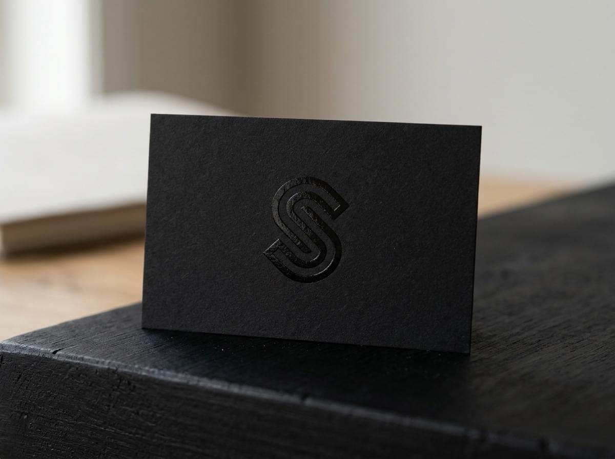
A black logo on a black card sounds like it would disappear. It doesn't. Gloss on matt black creates a subtle shape that appears as the card moves.
This one feels confident and modern. Keep your contact details in a light colour so they stay easy to read.
How to print it: black velvet or matt laminated card, with Spot UV on the logo or a pattern. Effort: Step Up.
7. Crafted Uncoated Card
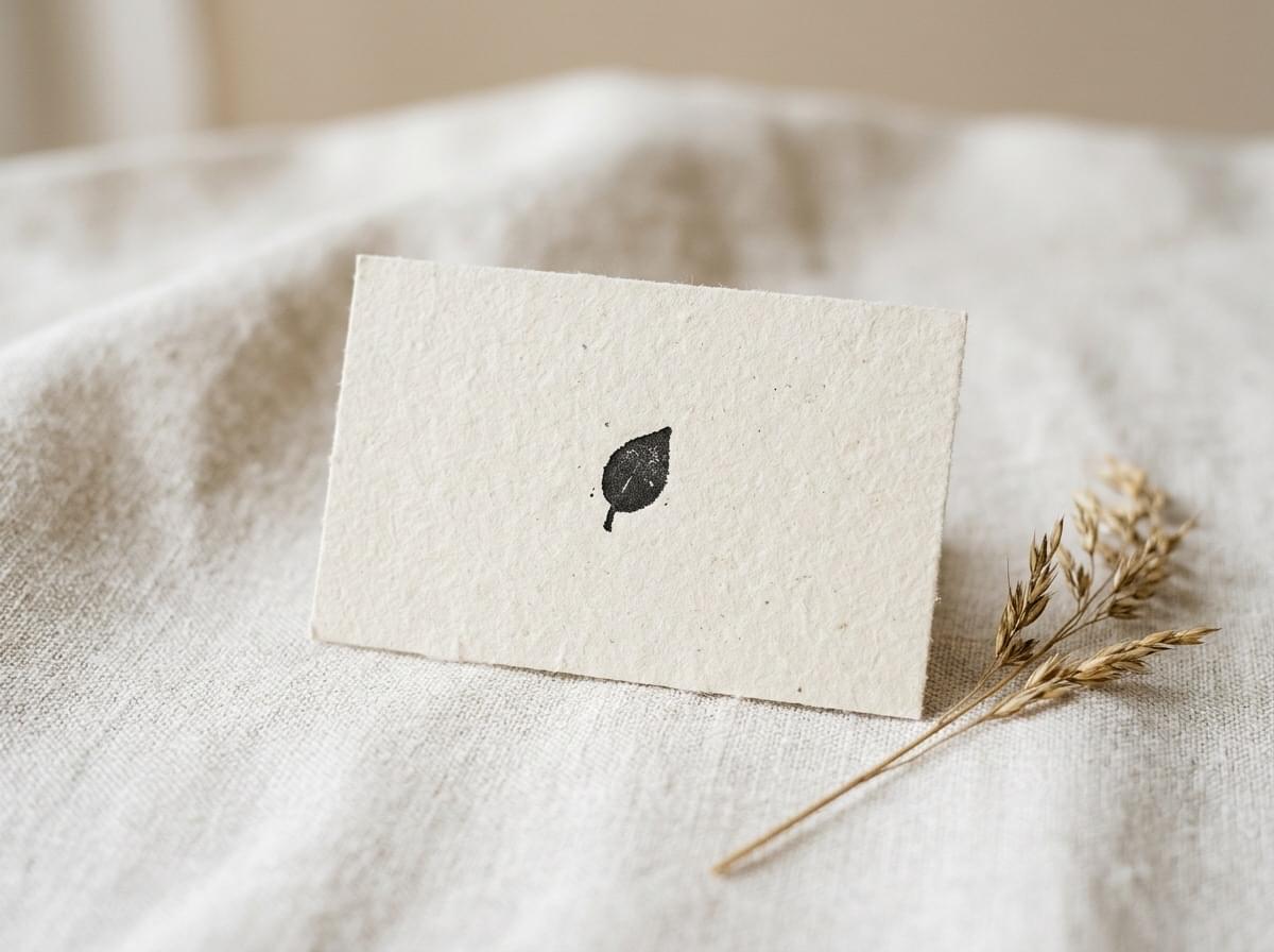
Uncoated stock has a natural, lightly textured surface. It feels honest and handmade, which suits cafés, florists, makers and studios.
Colours print a little softer than on coated card. Lean into that with earthy tones and simple type.
How to print it: premium uncoated stock. Effort: Simple.
8. Eco Card on Recycled Stock
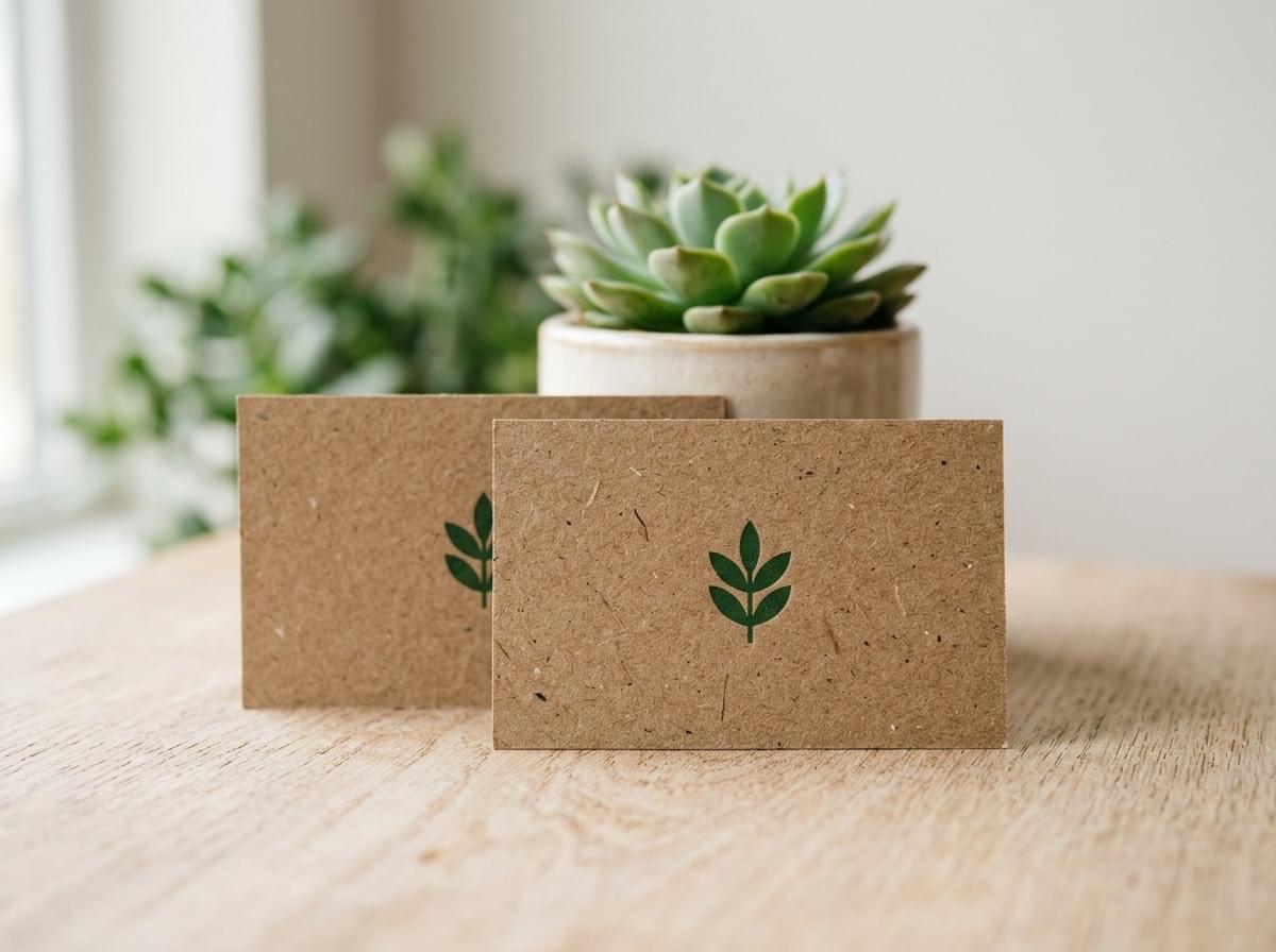
If sustainability is part of your story, your card should show it. Recycled stock tells people what you value before they read a word.
Pair it with a calm layout and natural colours. A short line on the back, such as "printed on 100% recycled card", is plenty.
How to print it: 100% recycled business cards. Effort: Simple.
9. Colour Suite Set
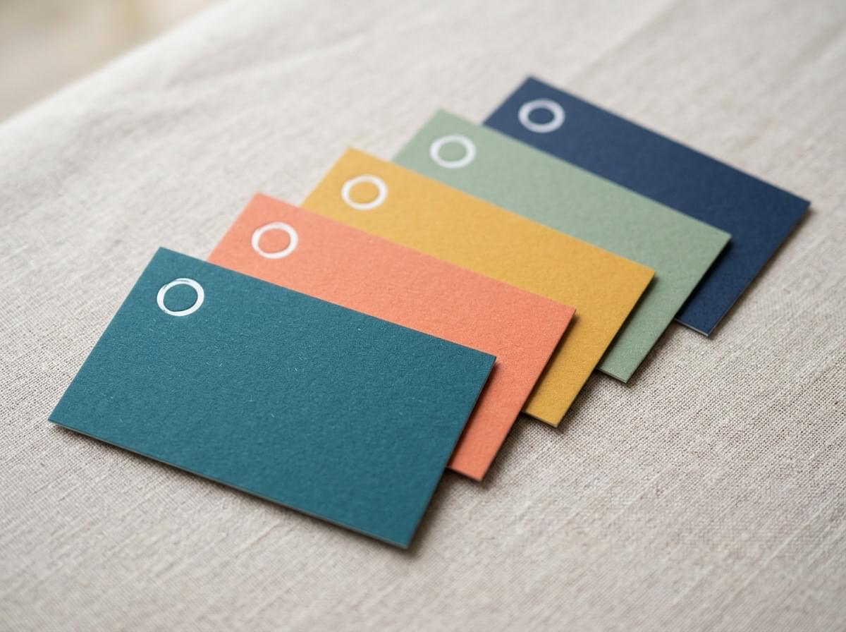
Keep one layout and print it in several background colours, one for each team member or department. Each card feels personal, yet the set clearly belongs together.
It shows personality without making the design busier. Spread a few on a reception counter and they make a display of their own.
How to print it: any stock, with each colour ordered as its own version of the same artwork through our custom printing services. Effort: Simple.
10. Bold Bright Illustration
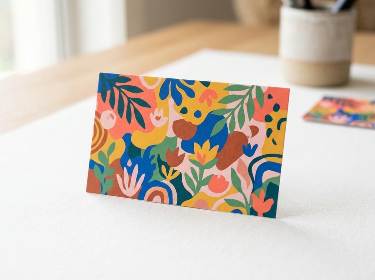
A playful illustration across the whole card turns it into a small piece of art. It suits creative studios, kids' brands, cafés and anyone whose work is colourful.
Gloss laminate makes bright colours look rich. Keep your text in a clear panel so it doesn't fight the artwork.
How to print it: gloss laminated card. Effort: Simple.
11. Brand Pattern on the Back
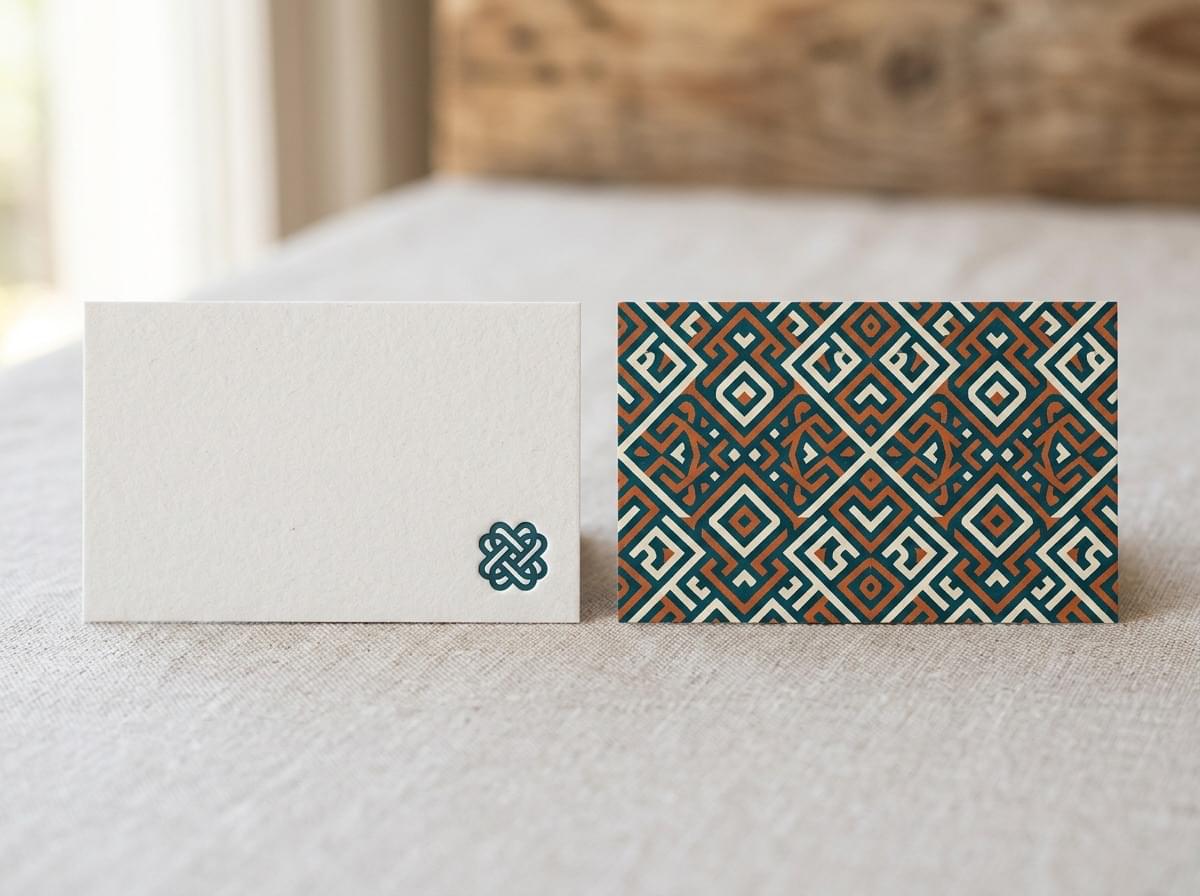
Put your logo and details on the front, then fill the back with a repeating pattern drawn from your brand. Icons, shapes or a monogram all work.
It makes the card feel finished from both sides. For an extra layer, pick out the pattern in Spot UV or Scodix.
How to print it: matt or velvet laminated card, with optional Spot UV or Scodix on the motif. Effort: Step Up.
12. Blueprint Style Linework
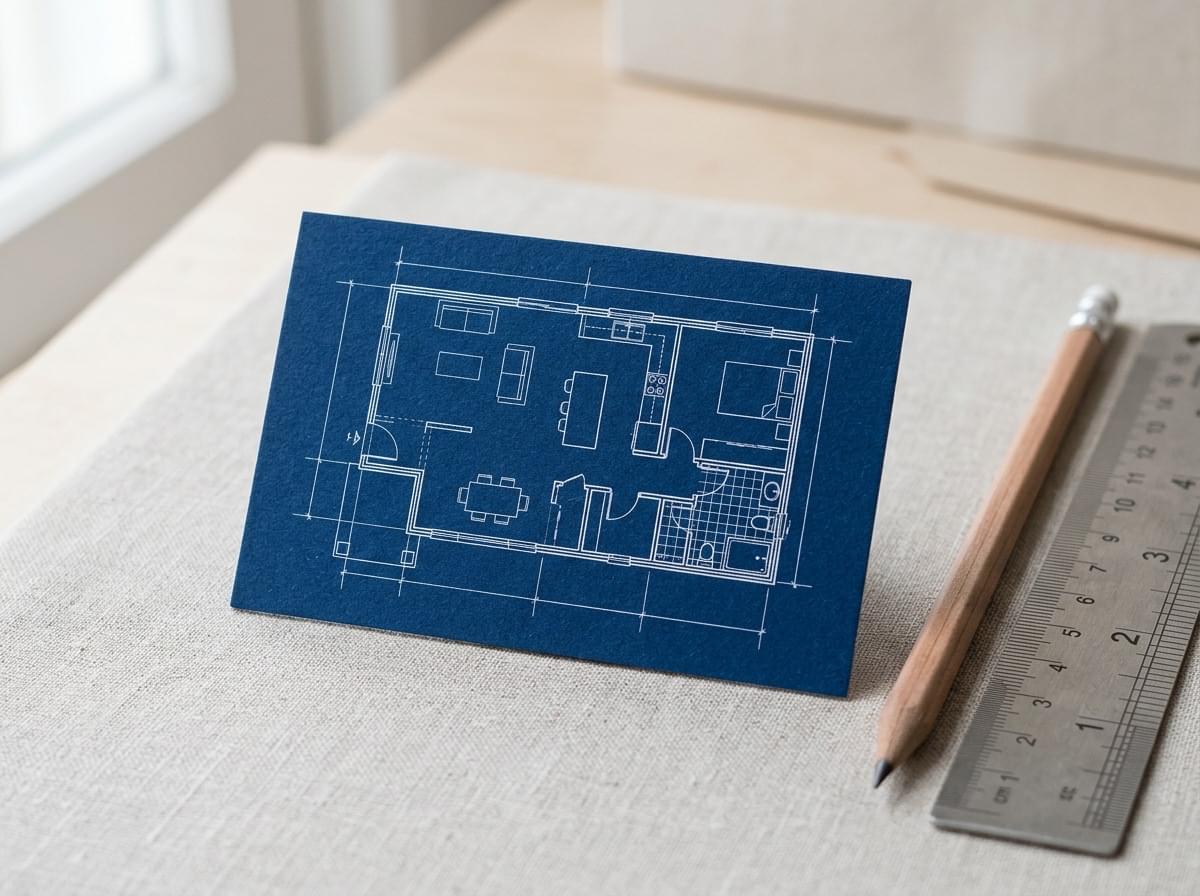
Fine white lines on a deep blue background feel technical and precise. It's a natural fit for builders, architects, engineers and designers.
Let one simple drawing carry the card, and keep the lines at a weight that prints cleanly.
How to print it: uncoated stock for a drafting paper feel. Effort: Simple.
13. Appointment or Loyalty Back
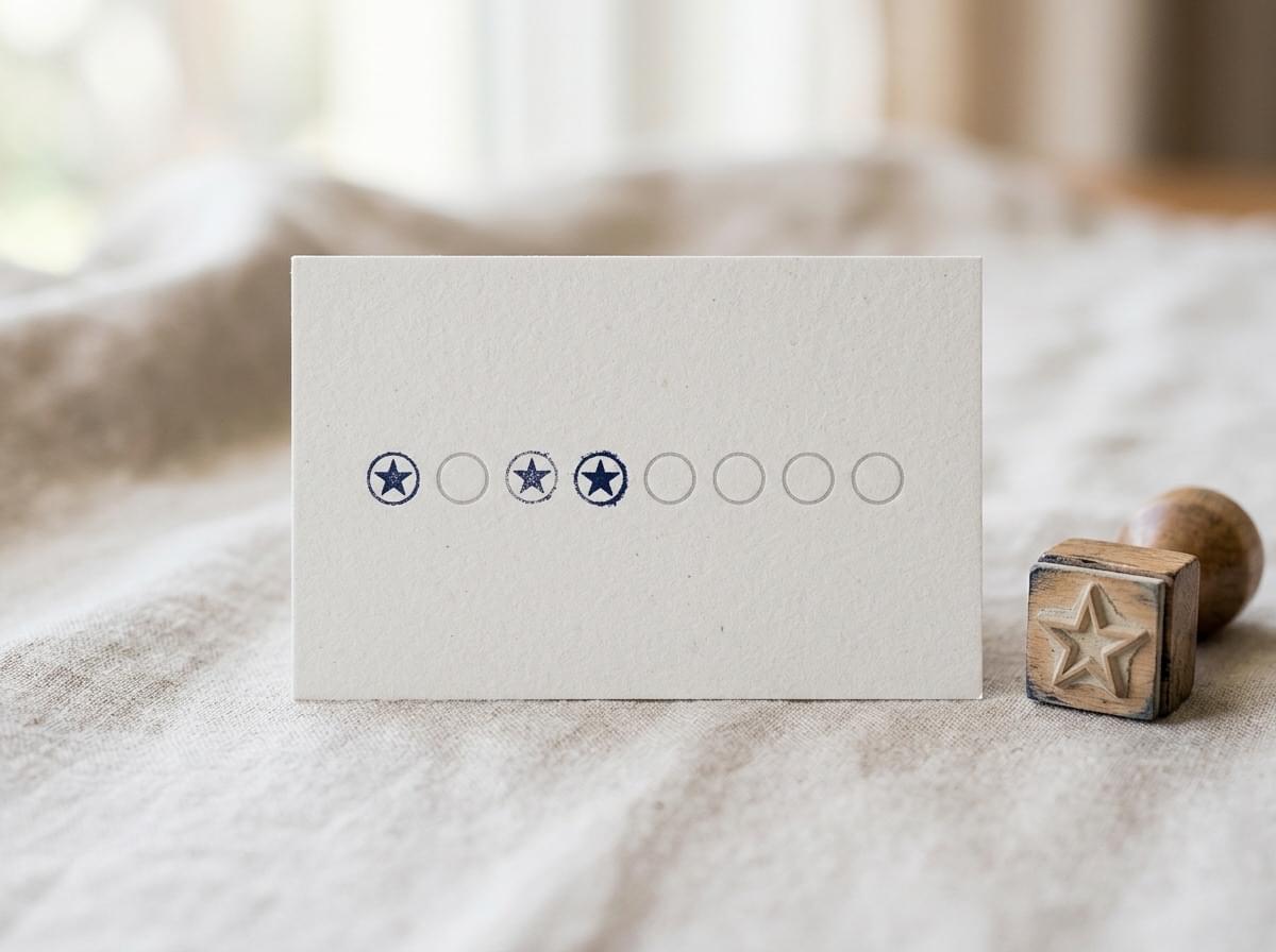
Print a row of stamp boxes or appointment lines on the back. Now your card has a job, and people keep it until their next visit.
It's ideal for hairdressers, clinics, cafés and trades with repeat customers.
How to print it: loyalty or appointment cards on uncoated stock, so pens and stamps mark cleanly. Effort: Simple.
14. Folded Card With More Room
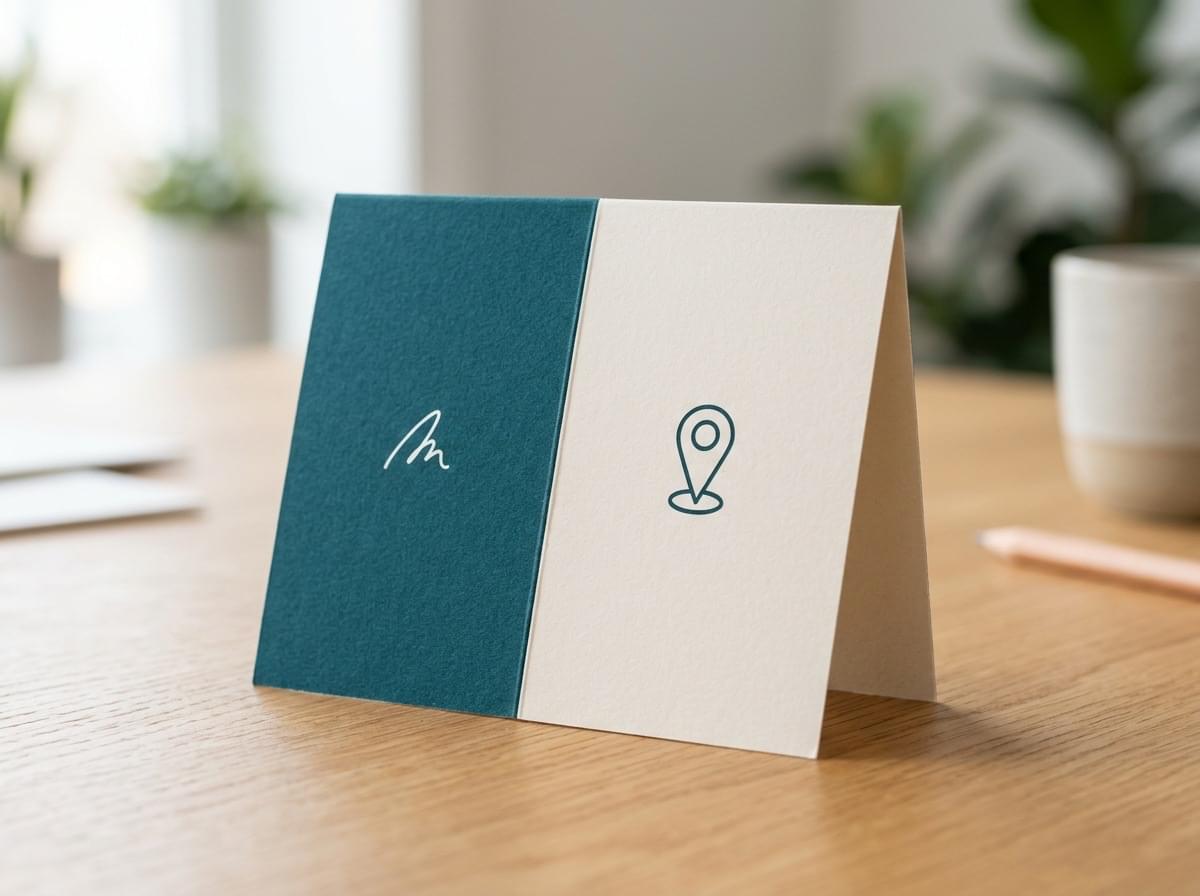
A folded card opens like a tiny booklet. You get extra panels for a list of services, a map or a short note about how you work, and it still feels like a business card.
If you need far more space than a few panels, our custom brochure printing is the better next step.
How to print it: folded cards, with a simple layout for each panel. Effort: Step Up.
15. A QR Code Done Right
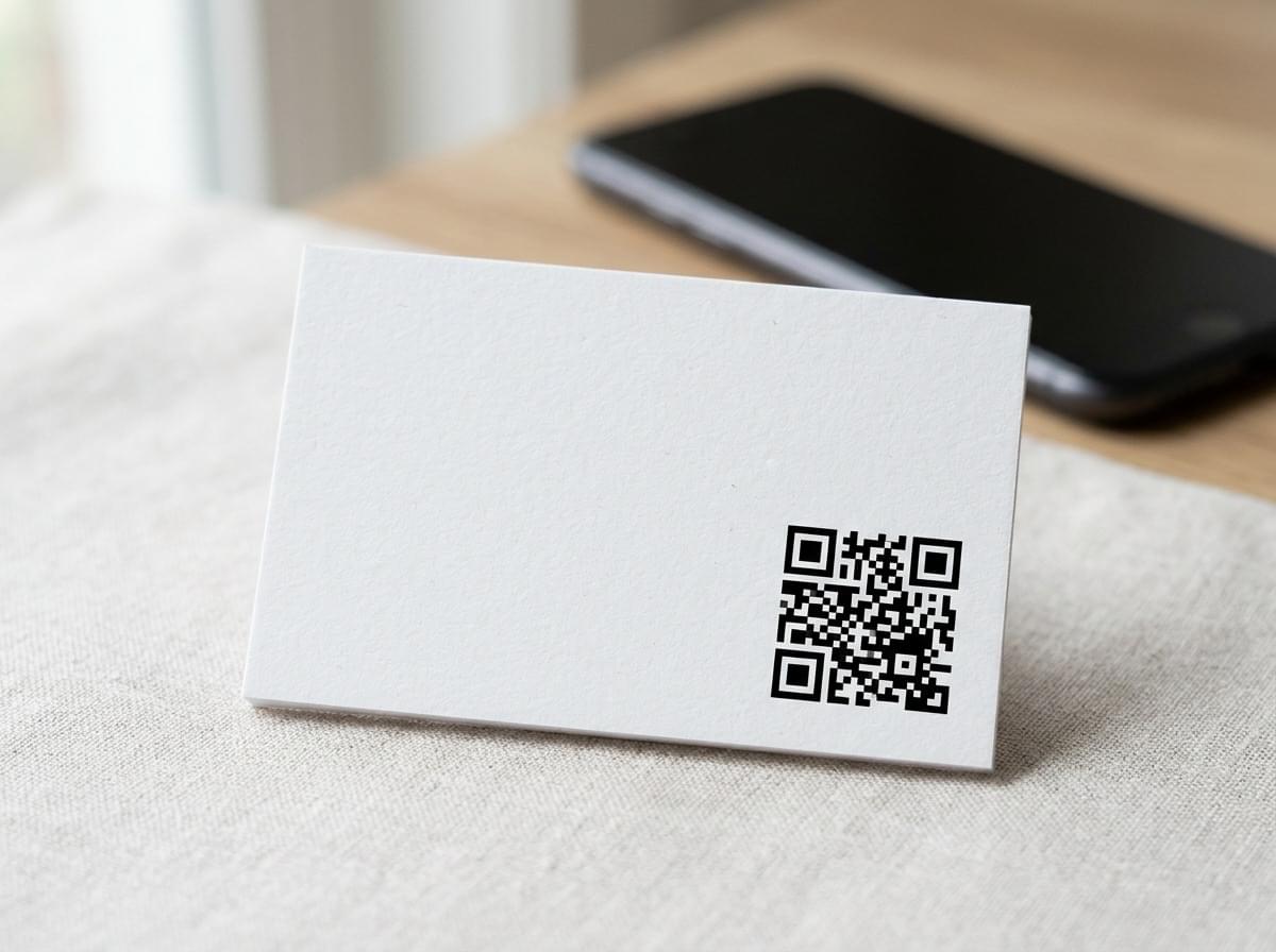
A QR code can link to your portfolio, booking page or menu. Done well, it turns a small card into a quick link to your work.
Print it at least 15 to 20 mm wide and leave a clear margin around it. Keep foil and Spot UV off the code, as shine can stop phones reading it. Then test-scan it from your proof.
How to print it: any stock, with the code in solid black ink. Effort: Simple.
Cool Business Card Ideas Compared
Here's every idea side by side, so you can shortlist the cool business cards that suit your brand.
| Idea | Stock or Finish | Effort | Best For |
|---|---|---|---|
| Minimal Type on Heavy Stock | Buffalo Board or artboard | Simple | Consultants, lawyers, designers |
| Spot UV Logo on a Matt Card | Matt laminated with Spot UV | Step Up | Almost any brand |
| Raised Texture You Can Feel | Scodix | Statement | Brands that want a memorable first touch |
| Metallic Foil Accents | Metallic raised foil | Statement | Luxury, property, events |
| Soft Touch Velvet Luxury | Velvet laminated | Step Up | Beauty, fashion, premium services |
| All Black Tone on Tone | Velvet or matt laminated with Spot UV | Step Up | Modern, bold brands |
| Crafted Uncoated Card | Premium uncoated | Simple | Cafés, florists, makers |
| Eco Card on Recycled Stock | 100% recycled | Simple | Sustainable businesses |
| Colour Suite Set | Any stock, several colours | Simple | Teams and studios |
| Bold Bright Illustration | Gloss laminated | Simple | Creative and family brands |
| Brand Pattern on the Back | Matt or velvet, optional Spot UV or Scodix | Step Up | Brands with a strong visual identity |
| Blueprint Style Linework | Uncoated | Simple | Builders, architects, engineers |
| Appointment or Loyalty Back | Uncoated loyalty or appointment cards | Simple | Salons, clinics, cafés |
| Folded Card With More Room | Folded cards | Step Up | Businesses with several services |
| A QR Code Done Right | Any stock, solid black code | Simple | Portfolios, bookings, menus |
How to Set Up Your File So the Effect Prints Right
Special finishes only look sharp when the file is built for them. Work through this checklist before you upload.
- Size and bleed. Build the card at 90 x 55 mm with 3 mm bleed on every side, so the background runs to 96 x 61 mm.
- Safe zone. Keep text and logos 3 to 5 mm inside the trim line so nothing gets cut.
- Colour. Set the file to CMYK, not RGB, so the printed colours match what you see more closely.
- Fonts. Convert all type to outlines so nothing shifts or swaps when the file is opened.
- A separate effect layer. Put Spot UV, foil or Scodix on its own layer as 100% K (solid black) vector shapes. They should line up exactly with the artwork underneath.
- Sensible detail. Avoid hairlines and tiny serifs under raised effects. Very fine shapes can fill in or break up.
- A proof. Ask for a proof and check it carefully before the full run goes ahead.
When your file is ready, upload it through our online printing services and our team will review it before it goes to press.
Mistakes That Make a Cool Card Look Cheap
A premium finish can't save a card that gets the basics wrong. Watch out for these.
- Too many finishes at once. Foil, Spot UV and Scodix on one card compete for attention. Choose one hero effect.
- Foil on fine type. Thin letters lose their shape under foil. Save it for bold shapes and larger text.
- Low-contrast text. Grey on black or pale on cream looks stylish on screen but is hard to read in a dim room.
- A tiny QR code. Shrinking it to fit means it may not scan, so it becomes decoration. Give it enough room and a clear margin.
- Gloss laminate where people need to write. Pens smudge on gloss, so cards meant for notes belong on uncoated stock.
- A crowded layout. Every extra line leaves less breathing room, and the finish has nowhere to shine.
Print Your Cool Business Cards With The Print Company
We're a commercial printing company with almost 50 years of combined experience. Our aim is to make print simple, so you can focus on the design while we look after the technical side.
Each of these stocks and finishes is available across our business card printing Melbourne range, from Buffalo Board to Scodix. If you're unsure which suits your brand, let us help you talk it through.
Cool business cards look even better as part of a set. Complete it with brochure printing for your services and poster printing for your shopfront, in the same colours and feel.
Frequently Asked Questions
What Is the Standard Size of a Business Card?
In Australia, the standard business card is 90 x 55 mm. It fits neatly into wallets and card holders. For bleed and safe zone measurements, see the file setup section above.
What Paper Weight or Stock Should I Use?
Most business cards sit somewhere between about 300 and 400gsm, and heavier boards feel more premium in the hand. Anything that bends too easily can feel flimsy. For stocks matched to a particular look, see the ideas list above.
What Should Go on a Cool Business Card?
Keep to the essentials: your name, role, business name, phone, email and website. Use the local mobile format (04xx xxx xxx), or +61 if you deal with overseas clients. Many sole traders also add their Australian Business Number, the unique 11-digit number that identifies your business to the government and the community.
What Should I Leave Off a Business Card?
Leave off anything people won't use to contact or remember you. That includes long service lists, numbers you never answer, personal details and fine print. Skip anything likely to change soon, such as a temporary address.
Should Business Cards Be Matte or Glossy?
It depends on your design. Matt and velvet feel calm and premium, while gloss makes bright colours pop. Pick the one that matches how bold your design is.
Make a Card Worth Keeping
Cool business cards don't need every effect. It needs one clear idea, the right stock and a file set up properly. Start with a Simple idea for a quick win, or choose a Statement finish when first impressions matter most.
Whatever you pick, we'll help you get it right on paper. And for bigger pieces, we can help with printing posters Australia businesses use for shopfronts and events.
Ready to print? The Print Company are Melbourne based specialists in professional print, delivering business cards Australia wide, with every file checked before press at no extra cost. Great print, made easy.
Prefer a tailored price? Give us a call on 03 8679 4587 or get in touch for a personalised quote.
